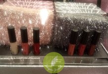
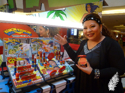
It’s a privilege to have an opportunity to interview makeup artists as they have a wealth of knowledge and experience to impart. They have so many tips and advice on makeup techniques which you can’t read in books or google up. Thus, it was a pleasure to be able to chat with the always amiable and personable Ms. Caressa Hanoom, MAC’s Senior Makeup Artist regarding MAC’s Spring/Summer Collection and the Wonder Woman Collection which is instore now.

For the benefit of those of us who weren’t present at Romero Jennings’ presentation of MAC’s Spring/Summer makeup trends, please tell us more about the 4 key trends for Spring/Summer 2011, Pop-Classic, Raw-Fined, Ice-Dream & Terra-Copper.
Caressa : Pop-Classic is a combination of old elements and modern techniques. It’s a classic interpretation of iconic looks worn by people like Marilyn Monroe, Cyndi Lauper and Madonna. It’s a look that mimics skintone with less application of powder. You’ll see colours like fuchsia pink, neon orange, turquoise blue. The focus is on lips or eyes (either strong look on eyes or lips), keeping skin bare and a dewy, baby-like skin.
Raw-Fined is a look which talks about “raw” skin, a healthy glow which comes from within and using mineralize products to apply like a powder but mimics your skin. Wonder Woman Collection’s Mineralize Skinfinish (MSF) has a choice of peach or pink sides. Complexion is creamy and the effect is damp/moist. Use the middle (section) of the MSF for shading and sculpting to mimic your skin. The shimmer (section) accentuates your features leaving no powdery effect.
Ice-Dream is similar to Pop-Classic. It’s avant-garde makeup, a little softer, chalky effect. It adds white hues/highlighters.
Terra-Copper is my favourite as I am a woman of colour. The 70s and 80s looks (a la Farrah Fawcett) bring a lot of elements to what we do today
What do you say to women who stay away from copper/brown shades because they are afraid it will oxidise on their skins especially if they have oily skins?
Caressa : Every woman needs a new look (so should not shy away from copper tones) and she can use a good primer to counter oxidisation. There are 2 new Prep+Prime products coming out soon. The first is Prep+Prime Vibrancy Eye which addresses the 3 key factors of eye vibrancy, i.e. uneven skintone, dark circles, eye bags. The peptide in the formula helps to flush off excess water so that eye bags reduce. The second product is the Prep+Prime Highlighter (Pen) which has 3 shades, peach (Bright Forecast), pink (Radiant Rose) and yellow (Light Boost). It’s used on high panels of the face to prime makeup. It adds an additional glow and prevents fast oxidisation. For now, there’s Prep+Prime Skin which gives a smooth application to makeup, prevents makeup from oxidising and ensures makeup stays put.
How do the colours in the Wonder Woman Collection embody the Spring/Summer 2011 colour trend?
Caressa : They reflect the Pop-Classic trend with eye-popping colours in the mascaras, glosses, lipsticks and pigments. The mascaras are not as coloured as what you see on the wand and complement the eyeshadow palettes.
What’s your advice to ladies who are wary of using coloured mascaras as they may have jobs in offices where strong makeup is a no-no?
Caressa : One can apply black as a base coat and the coloured mascara on the tips of the lashes using light strokes. You get a graduation of black/blue effect.
What is your favourite product or must-have product from this collection and why?
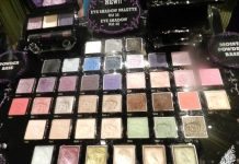
Caressa : The MSFs because they’re big enough for your brush to pick up the individual shades and they are value-for-money as they are 20g each. Makeup can be scary or intimidating for beginners and the combination of matte and shimmer shades equal a satin texture which is great for first-timers. It gives a sculpting 3-D effect.
MAC’s packaging and signature colour is traditionally always black but the packaging in this collection is in outstanding and vibrant colours. Is it a reflection of the Wonder Woman character?
Caressa : The packaging reflects the character. Wonder Woman was created by DC Comics in 1941 during World War II. The character represents the values of the women who had to work in factories during that time, courage, confidence, determination and commitment and the same applies to today’s women.
Some of the products in this collection are jumbo sized. Is this a deliberate attempt by MAC to make a bold statement?
Caressa : Yes, as (MAC’s Senior Vice President/Creative Director) James Gager put it, Wonder Woman is “larger-than-life” so there is a newness to the packaging.
The colours in the collection are rather bold and vibrant. How would someone who is afraid of using bold and vibrant colours use these colours?
Caressa : The best palette for someone like that is the green (Valiant) palette as it contains earthy green monochromatic tones. It’s taking one colour hues and adding elements of white, black and grey tones to these greens. So the most suitable starter palette is the green palette. Work the colours as close as possible to the lashes and move it upwards to build up the intensity.
If you were Wonder Woman for one day, what sort of superpower would you like to have and what would you do with it?
Caressa : I’m so happy you’ve asked this question as I was hoping yesterday that someone would ask me this. I would like to have the power to fight against AIDS and global warming. I would like to fight the stigma of AIDS. It’s very sad to see the children of mothers who have to go for treatment.
A big thank you to Ms. Caressa Hanoom for sparing the time to answer the above questions.

